A more creative and engaging landing page is needed to promote more potential users in the events to sign up for a free trial of the PressReader app, specifically speaking, to get higher conversion rates.
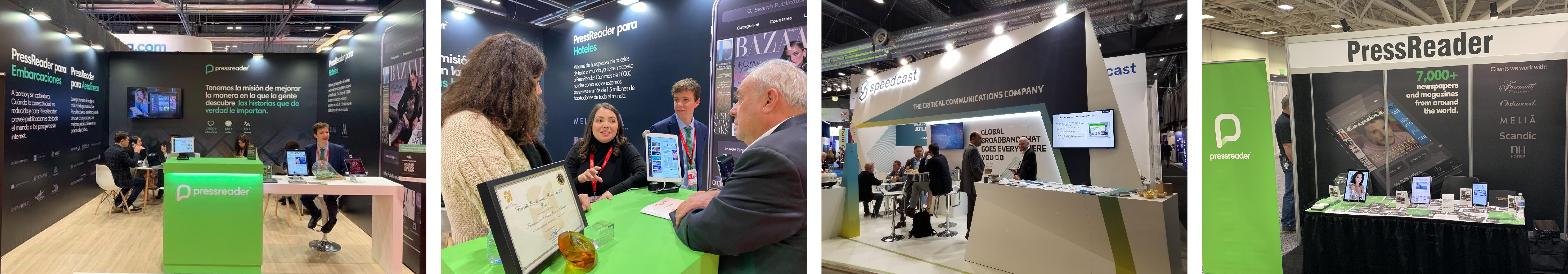
Figure 1 | Event booth is the lead to the landing page
The landing page before was all static, with no animation, which can lose the viewers' interest when browsing. Henceforth, I was responsible to bring life to the page by implementing CSS, JavaScript, and other techniques.
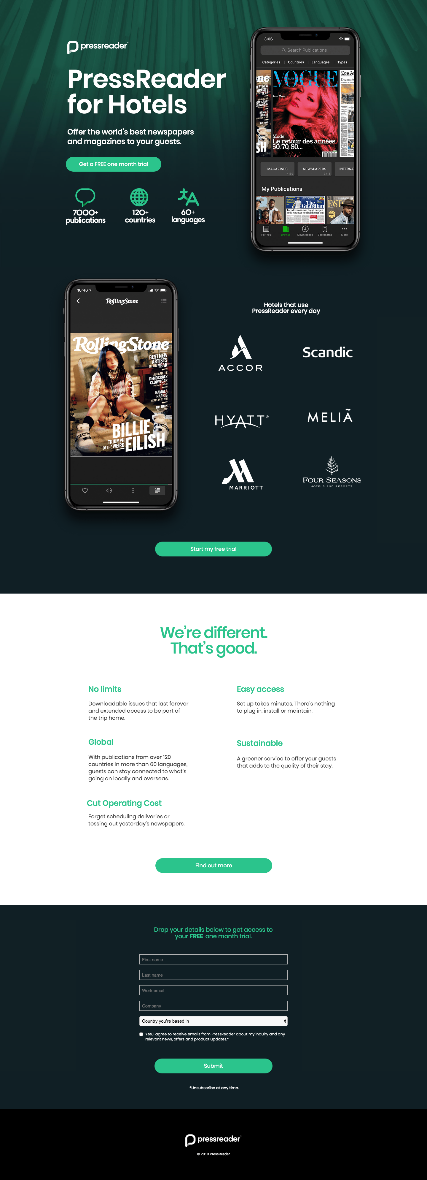
Figure 1a | Original landing page (desktop view)
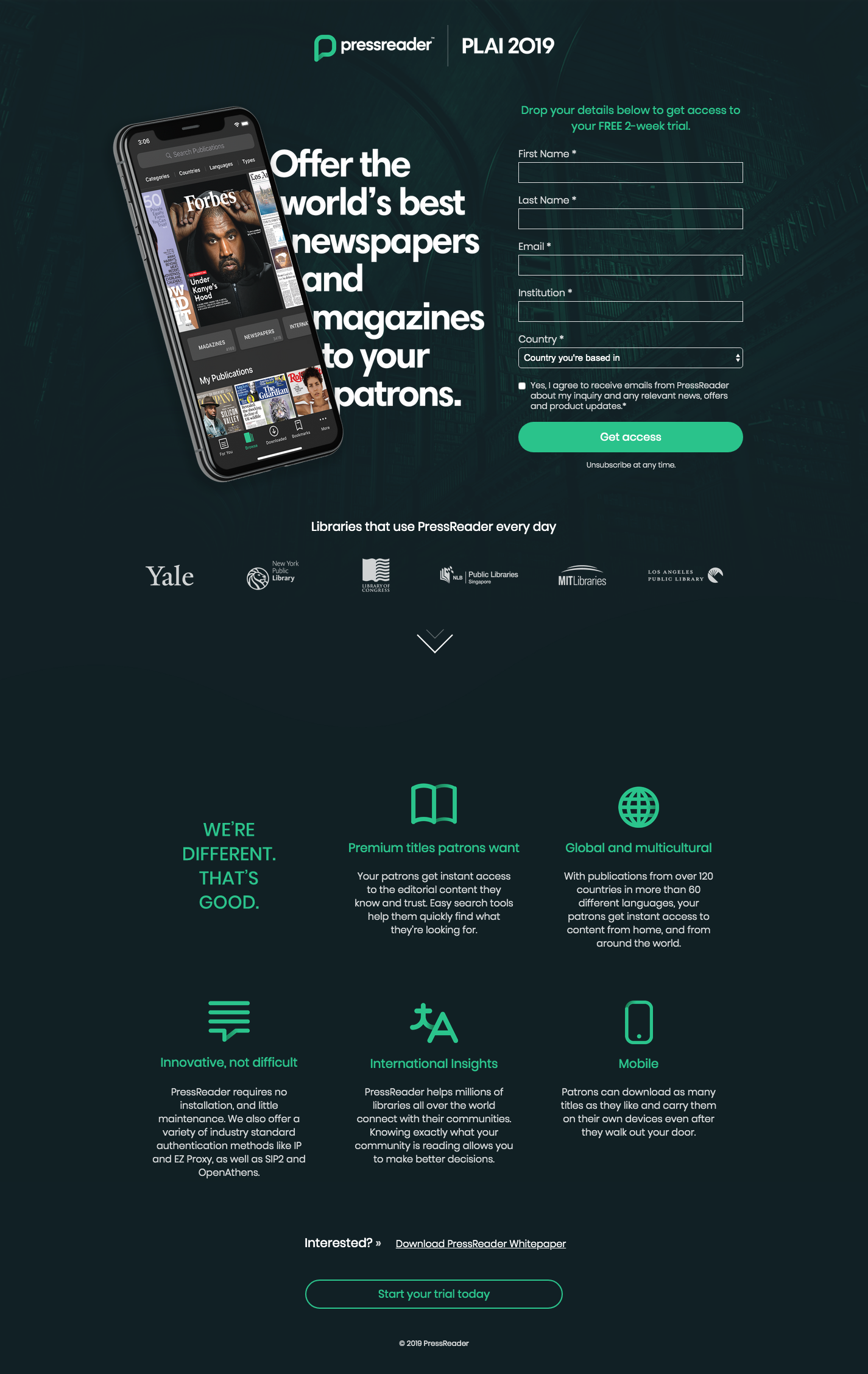
Figure 1b | New landing page (desktop view)
After researching multiple sign-up landing pages on some design websites, I decided to move the original sign up form from the page bottom to the top. As it is prompting the viewers as soon as they arrive at the page, it can be more clear to them about the offer.
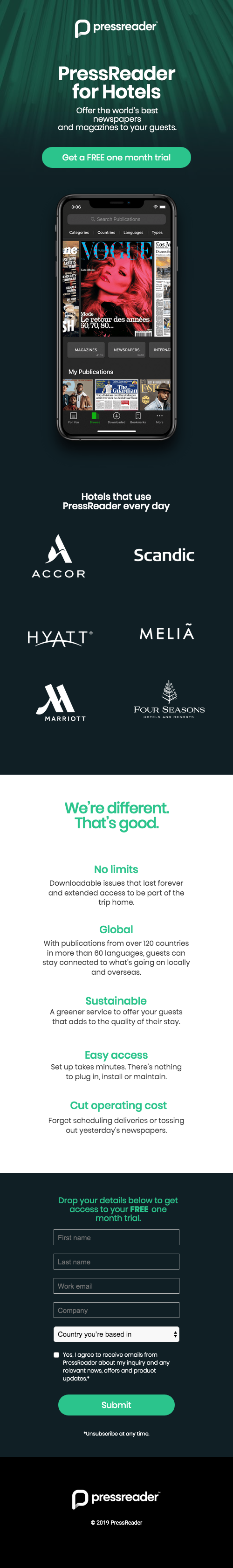
Figure 2a | Original landing page (mobile view)
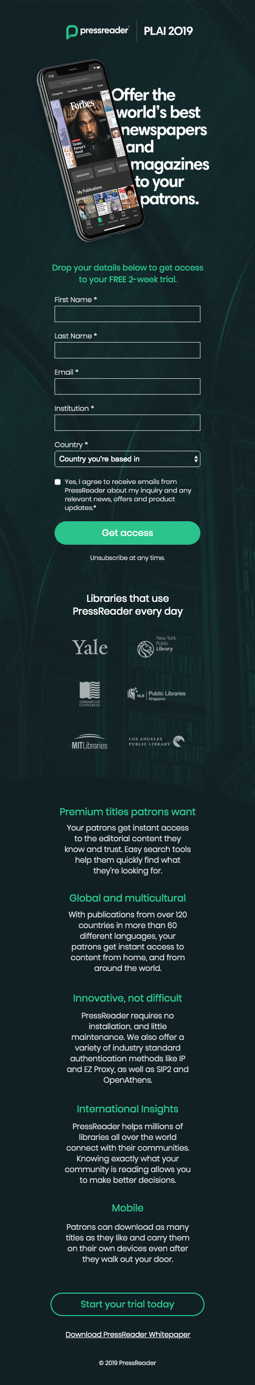
Figure 2b | New landing page (mobile view)
One big challenge is to animate icons to be placed on the page. The company’s icons all have gradient but not many SVG tools can animate it. Besides, the icons are already animated in After Effects by other motion graphic designer in the team, so I could save much time by making use of that. In the end, I figured out how to export SVG animation from After Effects and used it on the page by including Lottie.js. I apply hover effects to the animation so it plays when the user hovers to that section, which will not distract the users too much as well as give them a surprise to reveal.

Figure 3 | Animation of icons on hover
After iterative feedbacks and discussions with my supervisor, I made some refinements and finalized the design, and made it a template so that other designers can easily replace copies and images to use for other events in the future. (url)
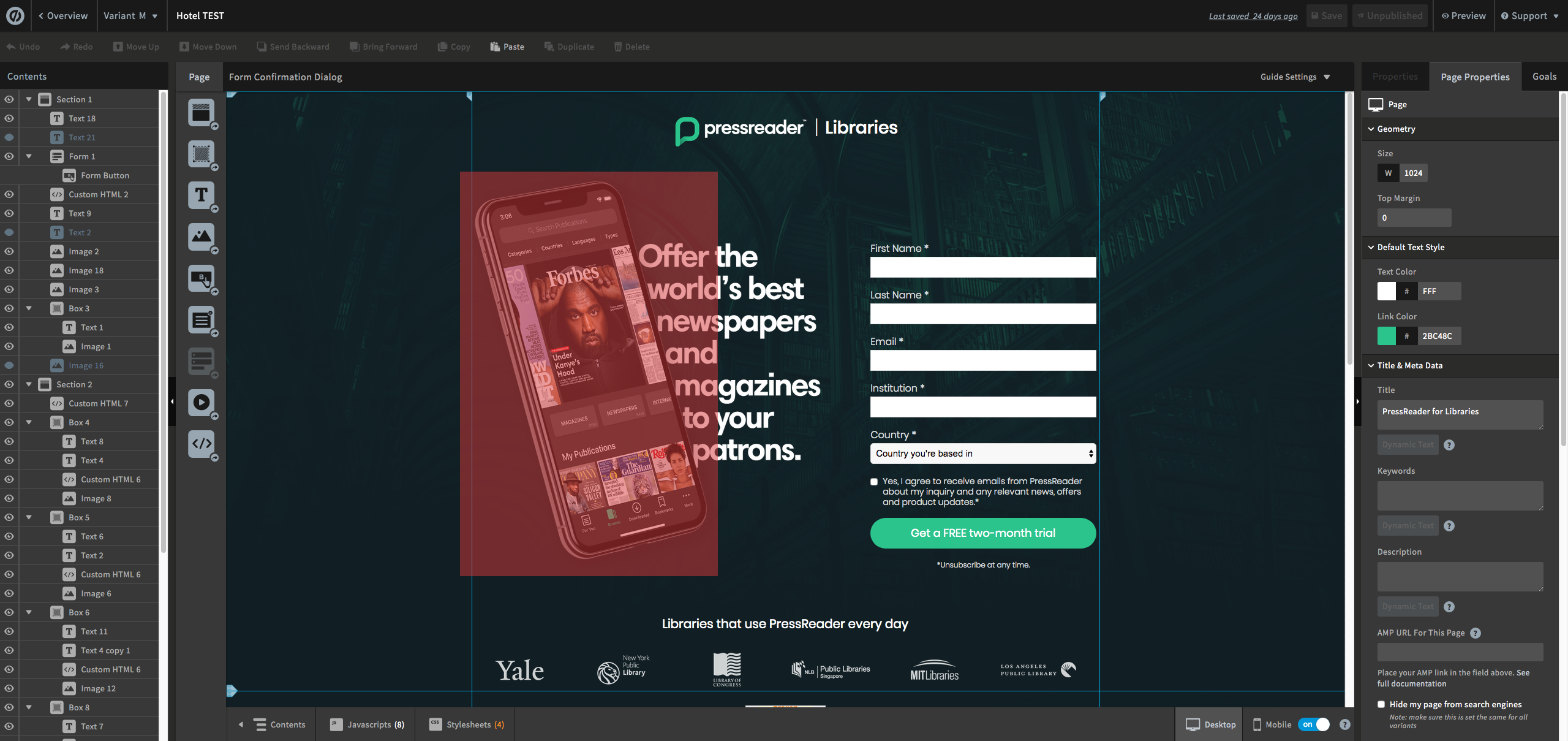
Figure 4 | Working interface on Unbounce

Figure 5 | Interaction of the whole page
The main take-away I had in this project is problem-solving skills and be creative under given constraints. Besides, I also learned to design a website that blends in with the brand’s look and feels.

Figure 6 | Black Friday promotion

Figure 7 | Category campaign - Fashion (url)
For the B2C campaigns I was involved in, I made landing pages based on another graphic designer's mockup and developed them on Unbounce as well as bring life by adding animation and interaction. The Black Friday campaign was the very first one and we learned a lot from it by the data we collect through heatmap and recording (see Figure 8a below), as well as A/B testing. Such that, we keep the mobile view much condensed and leave only the most important information. In the end, the new category campaign received an improved conversion rate and more users scroll to the bottom of the page (Figure 8b).
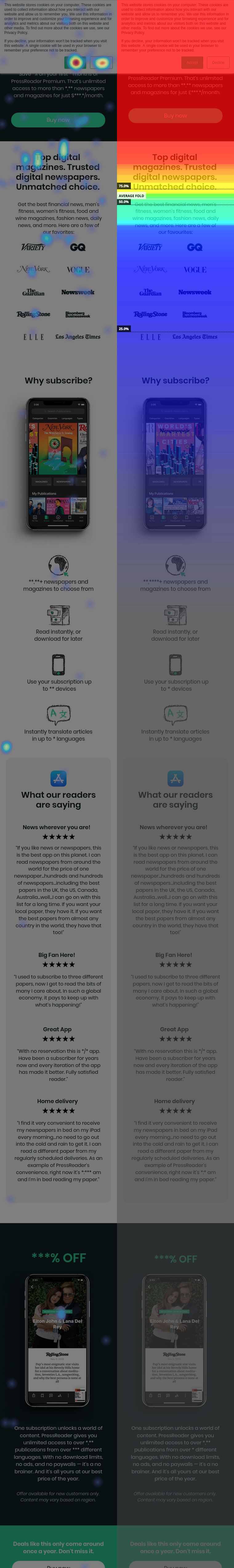
Figure 8a | Heatmap of clicks and scroll from Black Friday landing page
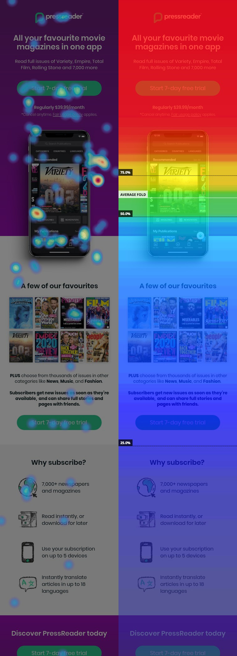
Figure 8b | Heatmap of clicks and scroll from Category landing page